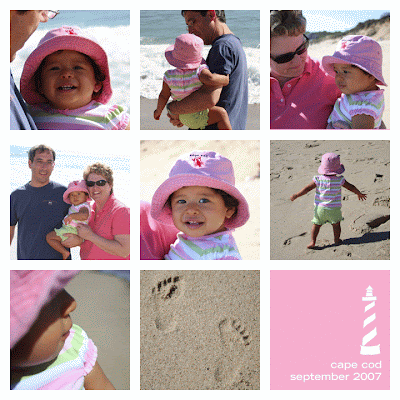
My blogging friend, Michelle's husband just started a new blog. He's an amazing photographer and is sharing some of his genius tips and tricks. This month, the challenge/tutorial was how to create a grid of photos using Photoshop or Photoshop Elements.
Creating the grid and following that pattern wasn't much of a challenge for me. Although, I will say the graphic designer in me, just wanted to bypass this step in Photoshop and just lay it out in InDesign. I am not a pro at Photoshop... I can find my way around to do some very basic stuff, but Illustrator and InDesign are definitely where my strengths lie. But, I did learn some cool tricks in Photoshop that I am quite excited about. Thanks Marc for the tips and for hosting this awesome challenge. Looking forward to learning more from you!
Here is the result of my efforts. What do you think?


I love it!! Great idea using the graphic in the corner, that is such a nice touch.
ReplyDeleteYou've obviously got a great eye! I love the "cape cod" color block on the bottom right. I was thinking of doing something similar with Eva. I know how great In Design is for layout (although I'm not good at using it) and I'm trying to keep things Photoshop Elements friendly for those with no CS3. Hope you'll keep doing the "Monthly Special."
ReplyDeleteThis is awesome. I love the footprint block and the color block that reflects the pink in the other blocks.
ReplyDeleteI love the picture you chose for this and I especially love the color block in the corner!
ReplyDeletei love the selection of photos for this grid - and am especially fond of the lighthouse image (i'm such a sucker for lighthouses...)
ReplyDeletegreat job with your grid...I have enjoying seeing so many good photo collages from Marc's challenge!
ReplyDeleteThanks so much. I absolutly love the picture of the foot prints. Its priceless!
ReplyDelete